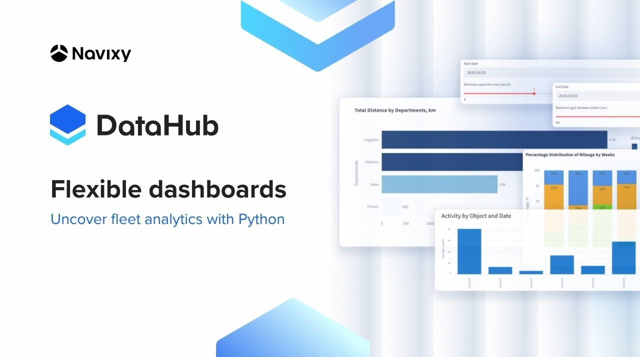
Custom dashboards in DataHub: unlock fleet analytics with Python

When fleet dashboards look perfect but answer the wrong questions, analysts start improvising — exporting CSVs, juggling Excel formulas, or hacking scripts to make sense of the data. It’s not a lack of skill; it’s the limits of traditional telematics platforms. Read the full article to learn how Navixy DataHub solves the problem.
Key takeaways
- Overcome platform limits by replacing rigid dashboards and APIs with a flexible, SQL-based data environment.
- Combine fleet, maintenance, and operational data in one SQL query.
- Use Python and DataHub together to design interactive dashboards that match how your organization actually runs.
- Connect any BI tool in minutes to deliver real-time metrics for operations, finance, and compliance teams, all from a single data source.
Why fixed telematics dashboards fail data teams
Telematics dashboards often promise clarity but in practice, they can feel more like locked boxes than windows into your data. They look polished but can’t group vehicles by garage, filter by maintenance status, or combine data across departments. Most fleet analytics systems are built around APIs with predefined schemas and endpoints. That structure ensures consistency, but it also restricts flexibility when you need to explore your data in new ways.
Because everything is predetermined, it’s hard to:
- Combine telematics data with internal business entities like departments, projects, or cost centers.
- Apply contextual filters such as “trips for vehicles whose maintenance is due this month.”
- Group results by driver, garage, or tag if those fields aren’t available in the default dataset.
The outcome is a reporting process that feels stuck. Analysts spend hours exporting data to Excel or writing quick scripts just to answer simple questions. Reports become outdated, and managers end up making decisions without a current picture of what’s really happening.
Meanwhile, real insight comes from the ability to ask questions in the same way your business operates. A maintenance team wants to see assets by garage to plan service loads. Operations struggle to compare utilization across drivers or regions. Finance aims to break down costs by department or project. A compliance team needs to flag after-hours vehicle use or excessive idling.
When your tools can’t adapt to those needs, analytics lose their relevance. Conversely, when data can be explored and reorganized freely, every team gets a view that actually fits how they work — without waiting for IT or a vendor to redesign reports. That is exactly what Navixy DataHub does by giving enterprises full flexibility to build custom dashboards that match their real-world operations.
Contact Sales if you are ready to build your own dashboard.
How Navixy DataHub enables open fleet analytics
Navixy DataHub provides PostgreSQL-native access to your telematics and business data. Instead of making API calls with limited filters, teams can use SQL to query any dataset in their private DataHub environment. This means:
- No rate limits or inflexible schemas.
- Ability to join tables across telematics, maintenance, and business domains allowing you to use any tools that are compatible with the database.
- Immediate compatibility with connections to all major BI tools in as little as 15 minutes.
- Embed built-in DataHub dashboards and reports into applications, including the Navixy web dashboard and mobile app.
Any system that “speaks SQL” can connect to DataHub. For integrators, it’s a plug-and-play setup: DataHub behaves like a standard database inside the corporate network. So onboarding takes minutes. And since each DataHub environment is client-isolated with SSL encryption, security and compliance requirements are fully met.
Use case: building a custom dashboard in Python with Streamlit framework
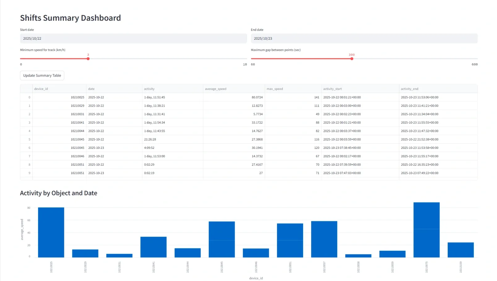
To illustrate how flexible this can be, consider a Streamlit prototype built on DataHub. In just a few lines of SQL and Python, you can:
- Request all trip data for a specific time window.
- Group by driver or department.
- Apply filters (e.g., only vehicles due for service in the next 10 days).
- Display the result as a live graph or exportable table.
This simple setup demonstrates what’s possible once data is no longer locked inside an API. Reports that once required hours of Excel work can now be generated or modified instantly.
Why did we use Streamlit for this example?
For teams with in-house Python expertise, Streamlit offers the most flexible way to turn DataHub queries into interactive dashboards and applications. This open-source framework lets developers rapidly prototype and deploy analytics interfaces while taking full advantage of Python’s ecosystem — from Pandas and Plotly to scikit-learn and TensorFlow.
When connected to DataHub, Streamlit becomes a powerful layer for building custom visualizations, testing machine learning models, and sharing interactive analytics across enterprise teams.
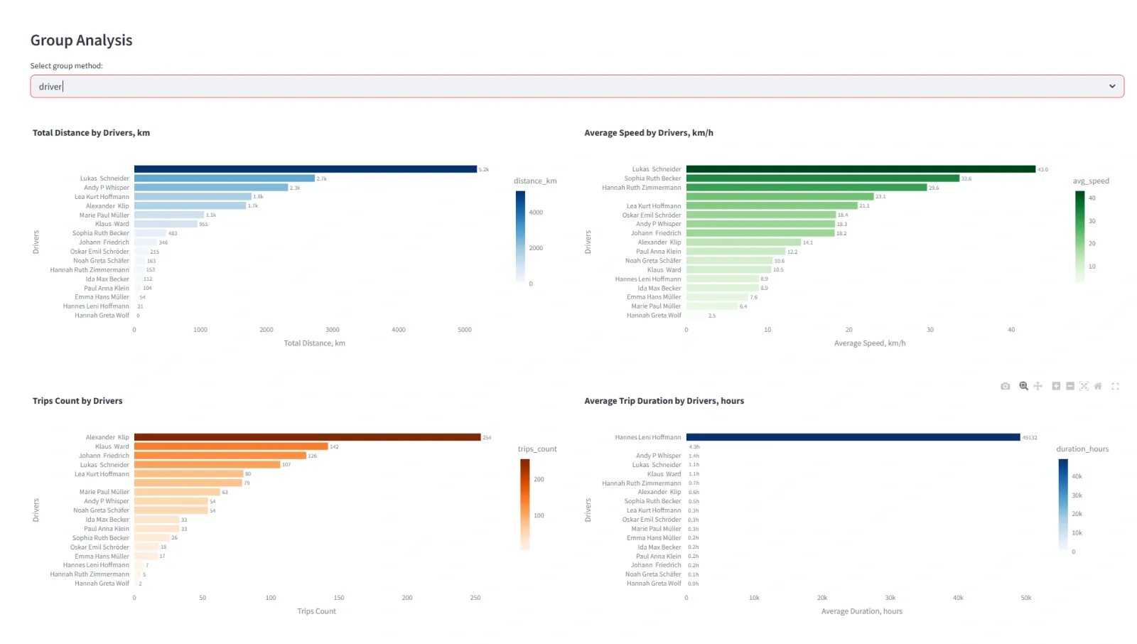
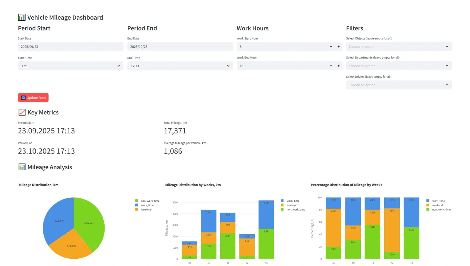
Managing how data is structured and displayed in your custom dashboard
Once your DataHub connection is active, you gain full control over how information is shaped, filtered, and presented. You can create a custom dashboard that mirrors your business’s actual structure, from departments and regions to project codes and maintenance cycles.
Complete exports for manual review
Retrieve all data (trips, events, or maintenance logs) for any period as a dataset or visualization. Export to CSV or Excel if manual analysis is required.
Flexible grouping and aggregation
Group by garage, driver, tag, or department. For example, track idle time across entire driver teams or compare utilization between depots.
Dynamic filters for operational use cases
Define custom conditions such as “vehicles active outside working hours,” “assets with overdue maintenance,” or “drivers exceeding fuel thresholds.”
Navixy DataHub gives analysts full command over data structure and presentation. These capabilities let teams focus on interpreting data, not cleaning or restructuring it.
Gain measurable value from your fleet management analytics
A prototype dashboard is only the start. Because DataHub behaves like a standard PostgreSQL database, it connects seamlessly to any enterprise BI tools, using the same data source your Python scripts rely on. This eliminates duplication and ensures that everyone, from analysts to executives, works from the same real-time data foundation.
For data teams, this unified approach drastically reduces time-to-insight. No more exporting, re-importing, or reconciling differences between systems. You build once, and every department can visualize their own metrics instantly, through the same DataHub connection.
Contact Sales to activate DataHub, connect your BI system, and experience the clarity of truly flexible analytics.